

design by Barnbrook Design, via virusfonts.com
It’s Day #2, and it’s The Next Day.
David Bowie is a veteran musician who’s been making music for the last five decades. He’s most famous for his 70’s albums and personas. It would be safe to say he has a history of pushing boundaries:

Ten years ago, Bowie released his 23rd album Reality and then disappeared utterly. Then, suddenly, from out of the blue, with no warnings, after years of silence, Bowie released a statement on January 8th, his 66th birthday. A new album was coming, and it would have this weird cover:
The background image is the cover from Bowie’s 1977 album “Heroes”. For anyone who has read or seen Perks of Being a Wallflower, the title track of “Heroes” is the song playing as they drive through the tunnel. You know, that song.
The Next Day‘s album cover was designed by British firm Barnbrook. Barnbrook also designed Reality‘s cover in 2003, and the cover for Bowie’s 22nd album Heathen in 2002:


I first saw The Next Day‘s album cover on an architecture blog, oddly enough. They thought the design was worth talking about, and shared a link to an interview with Jonathan Barnbrook.
I am a big fan of Bowie’s, and was excited he had a new album. In the five minutes I was hyperventilating, I had the chance to carefully consider The Next Day‘s cover. At first I didn’t like it. I was expecting something creative and expansive, like the designs for his previous two albums. I thought putting a box over Bowie’s face was too easy.
Once I calmed down, I read the interview with Barnbrook. I cried alone in my room listening to the new single, and looked at the album cover some more. Now, a few days later, I’ve changed my mind. The new album cover is actually amazing, and here’s why:
- The album cover has a great concept. The white box represents memory. “Heroes”, one of Bowie’s most cherished and critically acclaimed albums, is fading away.
- Barnbrook actually spent a lot of time developing this concept. The font in the middle is custom-made and inspired by North Korean airliners. I’m not kidding. Also, the packaging is great. The square motif is carried throughout. On his blog, Barnbrook talks about their struggles to keep the packaging free of extra logos and notices.

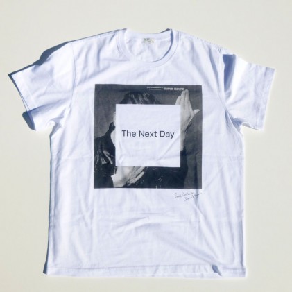
- The album cover has a strong visual impact. As a small thumbnail or at a distance, the thick, dark frame of the album is immediately recognizable. The dark grey and white make a sharp contrast, so The Next Day stands out boldly on the iTunes store. The album cover also looks great on a white t-shirt:

An interesting thing has happened to me. Every time I listen to a song off this new album, I see the dark grey used on the album cover. Each song now has an overcast feeling to it. A memorable album cover like this not only helps to sell the music, but changes what a listener feels when they listen to the songs.
As I said in my Yeah Yeah Yeah’s review, it’s been a questionable year for album artwork so far. This design is definitely one of the most challenging. The album cover for The Next Day is not meant to be liked immediately, but, like the songs on the album, loved over a long period of time.
Check out my other posts for “7 Days of Album Artwork” :
